Jump to content

Edit History

DrumDave

DrumDave


More accurate

Hi SmartDS- I don't think I was specific enough so here are some screen shots to try and illustrate the page that doesn't need to be there. I am using the default Paypal module.

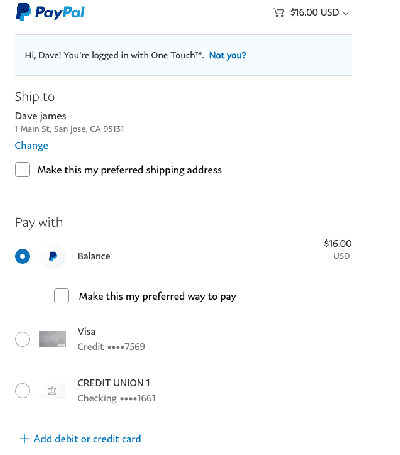
1: I've placed my order and gone to the Payapl Sandbox payment. It's processed:
Screen-Shot-1.png.dfb005f0720924027fe76f5a918f6a8e.png


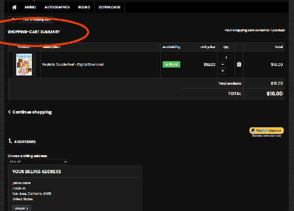
2: It takes me back to my site to this offending summary page : (this is the top half)
Screen-Shot-2.png.b8c7c90e9efdfe54db0cb01de87f12f9.png


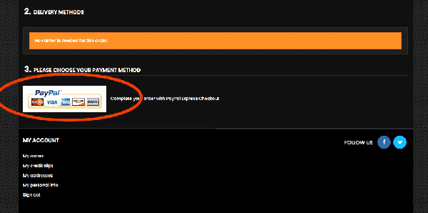
3: Then my customers have to scroll down in this page to find this button. They are going to think that their payment either didn't process or they are being charged for a second time. I want to skip over this page completely. There isn't a need for it in the customer's checkout process. If this page can automatically forward to the next page then fine but is it needed for the order process?
Screen-Shot-3.png.a2b1e2d7964b8e34f3fc5f8a00b4b433.png


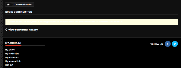
4: This is the next page (which has it's own special issues with the warning in white text in a yellow box!) This is what the customer should see after step 1. The order confirmation page, not the order summary page. They are going to know what they ordered anyway.
Screen-Shot-4.png.15ab4cda6563fb9b39c4fdd77ada3ec9.png


SO the Crux of this problem is simple in concept. I would rather this returns to my site from paypal (pic 1) to land on the order confirmation page (pic 4) The order summary and the scrolling thing needs to be an invisible part of the process. If not completely gone.

Hope this helps I have no clue where to find this to remedy the situation, What I know about this program wouldn't fill a teacup. :) I appreciate all the assistance.


DrumDave

DrumDave

Not quite there yet. So I will take some screen shots to try and illustrate the page that doesn't need to be there. I am using the default Paypal module.

1: I've placed my order and gone to the Payapl Sandbox payment. It's processed:

Screen-Shot-1.png.dfb005f0720924027fe76f5a918f6a8e.png


2: It takes me back to my site to this offending summary page : (this is the top half)

Screen-Shot-2.png.b8c7c90e9efdfe54db0cb01de87f12f9.png


3: Then my customers have to scroll down in this page to find this button. They are going to think that their payment either didn't process or they are being charged for a second time. I want to skip over this page completely. There isn't a need for it in the customer's checkout process. If this page can automatically forward to the next page then fine but is it needed for the order process?

Screen-Shot-3.png.a2b1e2d7964b8e34f3fc5f8a00b4b433.png


4: This is the next page (which has it's own special issues with the warning in white text in a yellow box!) This is what the customer should see after step 1. The order confirmation page, not the order summary page. They are going to know what they ordered anyway.

Screen-Shot-4.png.15ab4cda6563fb9b39c4fdd77ada3ec9.png


SO the Crux of this problem is simple in concept. I would rather this returns to my site from paypal (pic 1) to land on the order confirmation page (pic 4) The order summary and the scrolling thing needs to be an invisible part of the process. If not completely gone.

Hope this helps I have no clue where to find this to remedy the situation, What I know about this program wouldn't fill a teacup. :) I appreciate all the assistance.


×
×
  • Create New...