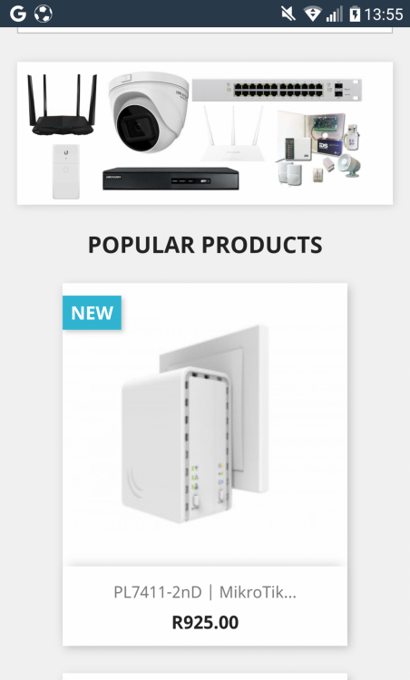
20 hours ago, carnagelan said:Hi Guys
I have been googling and cant seem to come right where people say i need to edit global.css where in the default theme i only have theme.css.
As the picture shows the list of products is smaller in width than the banner. I need to edit css so the product list matches the width of the banner only in mobile view as the desktop view is ok.
Well... mobile view is a bit generic.. Each smartphone has its unique screen resolution to match, and even like that, Media queries don't really work on a pixel perfect pattern (I mean, a mobile phone can use 1080 x 1920p screen, but its viewport width could perfectly be all the way from 378 to 480p on portrait)
With that in mind, I'd recommend setting a media query for devices up to 480p width and applying a new rule for the thumbnail-container. If you're using prestashop 1.7, chances are you have a theme.css, and an empty custom.css. Add your new media query to your custom.css to override classes declared in your theme.css without modifying the default settings
@media (max-width:480px) {

  #products .thumbnail-container, .featured-products .thumbnail-container, .product-accessories .thumbnail-container, .product-miniature .thumbnail-container  {
    width: match your banner width;
    height: fixed height to match your image height + product title;
}

}


