Search the Community
Showing results for tags 'overlap'.
-
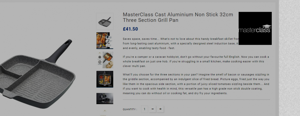
Hi everyone, if someone could please help that would be fantastic. I am using prestashop 1.8, PHP 8.0, theme Electron Mega Electronic Super Store, my domain is www.gr8-kitchenware.co.uk I have attached the a screenshot that shows my issue. On quite a few of my product pages the brand's logo overlaps my product's description and it looks a bit of a mess. I would like to know how I can change my files so that this logo fits nicely and doesn't overlap? Or if that is somehow not possible, how to remove the logo completely from this position. Thanks so much.
- 1 reply
-
- brandlogos
- product page
-
(and 3 more)
Tagged with:
-
When I visit a category in my store that has an assigned image, it overlaps the text and covers it. Also, in the category search box appears the magnifying glass in the center of the text box instead of appearing on the right. I use Prestashop 1.7.0.6 (newly installed) with the classic template (the one installed by default) and I have not made any changes in CSS or HTML. My website is www.viteperfumes.com I attach an image where you can see the problem. Hope someone can help me.
-
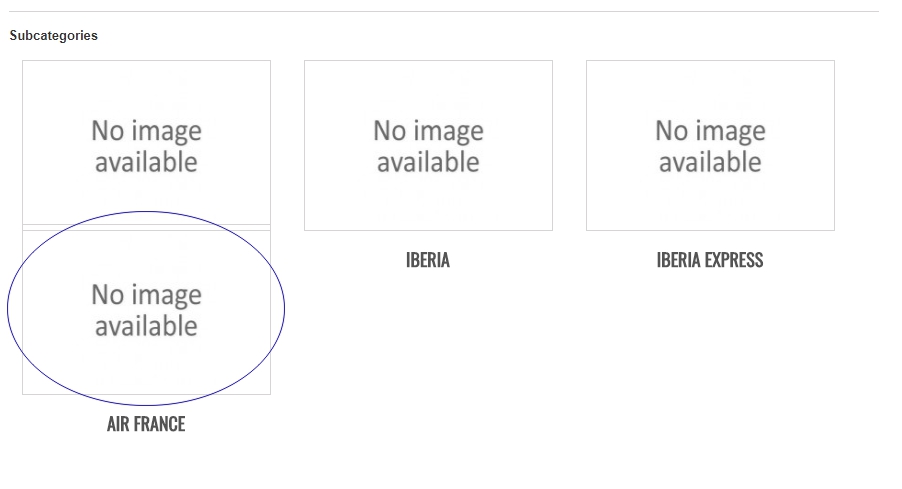
Hello everybody, I am trying to setup my Prestashop and at the moment I was able to change the thumbnails size for the subcategories, however, the second row overlaps onto the first row of products or subcategories. I am using BlackHawk 3.2 theme. I uploaded a screenshot showing the problem. My guess is that I have to change the height separation from each row of products or categories in the file product_list.css but I am not sure what do I need to modify. Hope somebody can help me, this is very frustrating Many thanks everybody, Guillem
- 2 replies
-
- images
- subcategories
-
(and 2 more)
Tagged with:
-
[solved] Logo Menu Search Overlap
JoeyPanda posted a topic in Ecommerce x PrestaShop [ARCHIVE BOARD]
I was in the middle of adding products and moving around modules....and all of a sudden. The logo is over lapping the menu and the search bar seems out of place I just took it out of maintenance mode....for the first time..running 1.5.4.1 was an install and no update. Not sure what happened. Any help is appreciated. I did try the suggestions in another thread about the menu being moved right but everything matched up. http://www.williamsn...rafts.com/store -
After I enabled paypal express in products page i found that the Paypal button and Add to wishlist are overlapping ! I tried to fix it by live editor but it not allowing me to place the module anywhere else you can check it here http://www.ekarti.com/index.php?id_product=1&controller=product&id_lang=1
- 1 reply
-
- whishlist
- paypal express
-
(and 1 more)
Tagged with:
-
When I hover on product image, the product container overlap next product which is under... Any solution of this?
-
Hi, I have spent days searching the forums and i have tried countless suggested fixes and none of them have worked. Can you someone please help and let me know what i need to change to accomodate the logo, I dont want to make the logo smaller. Thanks http://horshamartshop.co.uk/shop/index.php
-
Hello, I have the following problem: I have a module called Advanced Top Menu installed in my shop. The problem is that the <div> (my guess) will stay on top of the ajax shopping cart when the cart is expanded on mouse hover. I have temporarily circumvented the problem by just making the top menu box not so wide, ending before the shopping cart begins. This however makes the top menu look bad when the shopping cart is not expanded. Attached here is a picture of the situation with the shopping cart expanded. My wish is to get that cart on the very top. I have not made any modifications to the shopping cart code-wise.
- 1 reply
-
- top menu cart
- overlap
-
(and 1 more)
Tagged with:
-
The Top Horizontal Menu is unable to create gaps, it overlaps. How to solve it? I tried all means but still cannot. Please advise and help me, where to edit it? http://www.mamaonlinestore.com/shop1/
- 7 replies
-
- Top Horizontal Menu
- height
-
(and 2 more)
Tagged with:
-
Hi guys, As you can see here: www.freshfromthelabs.com my logo is over-lapping my top horizontal menu. This has been driving me mad. I don't see why prestashop doesn't create a default response where it moves everything down, to accomodate the size of the logo. I don't want to make my logo any smaller than it is, and I would also like to make it sit a bit more in the centre, as it's slightly to the right. Can anyone help me with this very annoying problem? How can I get my prestashop to move DOWN a little bit, so that my logo can sit on TOP of the site. Also, is there any way I can move it a little to the left? I can't fathom why there isn't a drag-and-drop solution to this. Any help would be greatly appreciated! Nick
-
Hello, On my main page some of the featured product's name and short description is over lapping (pls check http://www.kc-india.com/Site) how can I solve this formatting issue and avoid the same in future Thanks for help in advance Cheers
- 6 replies
-
- product name
- short description
-
(and 2 more)
Tagged with:
-
Hello. I recently updated my prestashop and have run into a serious issue. My home page was all jumbled up and I am down to my last problem but am struggling to solve the problem. My images in the home slider when they change is showing multiple pictures at once. I use "Image Slider for your homepage". I think the problem lies in my grid_prestashop.css file. I have done some customization and can't figure out my problem. I do not have much experience and am just learning as I go along. (Attached is photo of slider issue. I know how to move the yellow image number just need help with image overlapping) Thanks for the help!! /* Variable Grid System. Learn more ~ http://www.spry-soft.com/grids/ Based on 960 Grid System - http://960.gs/ Licensed under GPL and MIT. */ /* Containers ----------------------------------------------------------------------------------------------------*/ .container_9 { margin:0 auto; width: 980px; } /* Grid >> Global ----------------------------------------------------------------------------------------------------*/ .grid_1, .grid_2, .grid_3, .grid_4, .grid_5, .grid_6, .grid_7, .grid_8, .grid_9 { display:inline; float: left; position: relative; margin-right: 20px; } /* Grid >> Children (Alpha ~ First, Omega ~ Last) ----------------------------------------------------------------------------------------------------*/ .alpha {margin-left: 0;} .omega {margin-right: 0;} /* Grid >> 9 Columns ----------------------------------------------------------------------------------------------------*/ .container_9 .grid_1 {width:91px;} .container_9 .grid_2 {width:202px;} .container_9 .grid_3 {width:313px;} .container_9 .grid_4 {width:424px;} .container_9 .grid_5 {width:980px;} .container_9 .grid_6 {width:646px;} .container_9 .grid_7 {width:757px;} .container_9 .grid_8 {width:868px;} .container_9 .grid_9 {width:980px;} /* Prefix Extra Space >> 9 Columns ----------------------------------------------------------------------------------------------------*/ .container_9 .prefix_1 {padding-left:111px;} .container_9 .prefix_2 {padding-left:222px;} .container_9 .prefix_3 {padding-left:333px;} .container_9 .prefix_4 {padding-left:444px;} .container_9 .prefix_5 {padding-left:555px;} .container_9 .prefix_6 {padding-left:666px;} .container_9 .prefix_7 {padding-left:777px;} .container_9 .prefix_8 {padding-left:888px;} /* Suffix Extra Space >> 9 Columns ----------------------------------------------------------------------------------------------------*/ .container_9 .suffix_1 {padding-right:111px;} .container_9 .suffix_2 {padding-right:222px;} .container_9 .suffix_3 {padding-right:333px;} .container_9 .suffix_4 {padding-right:444px;} .container_9 .suffix_5 {padding-right:555px;} .container_9 .suffix_6 {padding-right:666px;} .container_9 .suffix_7 {padding-right:777px;} .container_9 .suffix_8 {padding-right:888px;} /* Push Space >> 9 Columns ----------------------------------------------------------------------------------------------------*/ .container_9 .push_1 {left:111px;} .container_9 .push_2 {left:222px;} .container_9 .push_3 {left:333px;} .container_9 .push_4 {left:444px;} .container_9 .push_5 {left:555px;} .container_9 .push_6 {left:666px;} .container_9 .push_7 {left:777px;} .container_9 .push_8 {left:888px;} /* Pull Space >> 9 Columns ----------------------------------------------------------------------------------------------------*/ .container_9 .pull_1 {left:-111px;} .container_9 .pull_2 {left:-222px;} .container_9 .pull_3 {left:-333px;} .container_9 .pull_4 {left:-444px;} .container_9 .pull_5 {left:-555px;} .container_9 .pull_6 {left:-666px;} .container_9 .pull_7 {left:-777px;} .container_9 .pull_8 {left:-888px;} /* Clear Floated Elements ----------------------------------------------------------------------------------------------------*/ /* http://sonspring.com...clearing-floats */ .clear { /*clear: both; display: block; overflow: hidden; visibility: hidden; width: 0; height: 0;*/ } /* http://perishablepre...earfix-css-hack .clearfix:after { clear: both; content: ' '; display: block; font-size: 0; line-height: 0; visibility: hidden; width: 0; height: 0; } .clearfix { display: inline-block; } * html .clearfix { height: 1%; } .clearfix { display: block; } */
-
Hello, I have a problem with 2 modules. The slideshow and carousel module cover a bit of the right column of my website theme. Could anyone please help me! Moreover, is it possible to extend the slideshow module to the whole width of the page (that is, including left column, center and right column)? Thank you in advance!