Search the Community
Showing results for tags 'mobile device'.
-
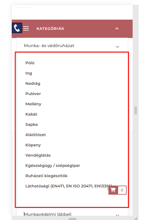
Hello, On one of our websites, the link in the submenu cannot be clicked on a mobile device. Unfortunately, I can't find the solution. I would like to ask you for help and advice. The website: munkaruha-munkacipo.hu Theme: LeoTheme PS.1.7 Thank You!
- 1 reply
-
- mobile device
- leo
-
(and 1 more)
Tagged with:
-
I use PS 1.5.6.2 and if somebody clicks on the "Confirm order" button (after selecting payment type) the order confirmation page does not display on mobile devices (I use the default mobile theme) with Android Chrome and Firefox. It works correctly in PC browsers. What can be the problem, how can I debug it?
-
- order confirmation
- mobile theme
-
(and 1 more)
Tagged with:
-
Hi everyone, A customer has bought it to my attention that Paypal isn't working correctly on mobile devices. It displays a grey question mark box, so the logo and associated text is all missing, leading customers to believe that bank wire is the only available payment option. Of course if you click on the box it does lead to the next page for payment processing but the customers don't know this! This is only in the checkout page - all other pages display the logo correctly, and on a desktop computer it is visible so it's only a problem for mobiles. I have the version 3.10.1 - can anyone explain how I can fix this? I should add I don't know anything about code but am willing to give it a try if you can talk me through what needs to be done. Thanks in advance, Stephanie
-
I have modified a bit of the default theme. Now it looks close to what I want to have. It works well on desktop ( mac, haven't test on windows yet) and iPad. Checking the site with iPhone and Samsung Note both somehow look out of places. www.cookcase.com I squeeze quite a few thing into the nav bar, don't know if that's the cause. Please, anyone have an idea what is going on? and how should I fix this?
-
Hello, I installed Prestashop 1.6.0.5 on local computer (XAMPP V3.2.1, appache 2.4.7(win32), php 5.5.9, Mysql 5.6.16). When I access test site from mobile device with android (Samsung Galaxy S3 and Huawei Ascend G510) with stock browser (called "browser") there is problem with menus. When I touch on menu which have submenu items, "top" menu is closing submenu items immideatelly thus not allowing me to click on submenu item. Prestashop: 1.6.0.5 theme: default prestashop theme installation type: new hosting: local
-
Hi On http://smokeit.erpbasen.dk I'm not able to add products to cart on mobile devices. How can it be? If I add a product to cart and afterwards want to see it, it says that the cart is empty?
- 2 replies
-
- opc
- mobile device
-
(and 2 more)
Tagged with:
-
Hi We are looking for a person who can help us with making some changes to an existing template so it will look nice on mobile devices like tablets, android, iphone and ipad. It's regarding the website http://smoke-it.dk which has some small bugs regarding mobile devices. 1. Footer does not follow the rest of the design regarding the width when scaling. 2. The search field in the top looks strange. 3. At the top of the page, there's a green bar in the background. This should be removed. 4. The shopping cart text at the top does not look good fx on ipad 5. When entering a product, the content of other products in the same category is strange. 6. The green bar at the bottom where phone, newsletter and social icons is showed, looks strange regarding the text and positions.