.png.022b5452a8f28f552bc9430097a16da2.png)

Search the Community
Showing results for tags 'iPad'.
-
Hello everyone, proud to announce the launch of Seller Assistant app - available for free on #Apple #app #store! And #Google #Playstore! Seller Assistant is an intuitive tool that helps PrestaShop sellers quickly manage customer communications, keep an eye on their orders and banking information. Download for free https://sellerassistant.foolab.app/

-
 I have looked all most every inch through in Chrome console, to find the bug. I also have searched google empty for informations regarding this problem. I can't find any error, so I hope there's someone here there could help me. The site is: https://shop.hjortsmykker.dk and the problem occurs only when the screen width = 768. I have tried to tweak some .css and some .js, but I ending up restore old values. Hope for help Regards, Leif B.
 -
Bonjour à tous, J'ai un problème d'affichage sur iPad, car mon menu est trop long. Je voudrais que mon thème se mette en mode responsive à partir de la taille des écrans tablette à savoir 768 x 1024, et ceci dans les 2 sens, donc en clair à partir d'un écran en 1024 que le menu et tout le header du site passe en mode responsive comme sur smartphone Mais si c'était aussi facile, je ne posterais sur le forum. Je suis sous prestashop 1.7.5 Le thème concerné est: https://addons.prestashop.com/demo/FO33730.html Merci d'avance pour votre aide. Cordialement. NB: je vous joins le fichier CSS si besoin theme.css
-
I tried hours to figure out why the apple-touch-icon does not work when adding a normal bookmark into favorites. There apprease the famous "question mark" instead of the icon. However it works finde when saved to home screen. Prestashop Version 1.6.1.13. There are no 404 messages in the logfile related to the icons. It used to work both sides with prestashop 1.5.6. A fresh and clean install with 1.6.1.13 results in the same behavior as on our installation. It does not seem to be a specific problem with our installation. I also checked the HTML source from a website with an apple-touch-icon plugin. There, the images are saved under the modules path instead of root. I also tried this with no success. Any help is appreciated. Thanks. Scully
-
 Hola, Versión: 1.6.0.9 Tema: Deafult Bootstrap (por defecto de Prestashop) Me pasa una cosa muy rara, y llevo todo el fin de semana viendo que puede ser, consultando foros y no doy con nada, y estoy un poco desesperado porque es bastante grave el error. Resulta que en mi tienda, si la veo desde un pc o mac, cualquier navegador, chrome, i.e, firefox, etc... se ve perfectamente y todos los precios de mi tienda están con IVA aplicado. El problema viene cuando abro la tienda desde un dispositivo móvil, ya sea una tableta android, iphone o iPad, los productos que veo a través del dispositivo movil aparecen sin IVA incluido, y es un problema porque la tienda dice el producto vale 10€ (Iva incluido) y no es verdad, no está aplicando el impuesto para los dispositivos móviles. He mirado también en los grupos de clientes y está todo correcto, en los tres grupos está configurado que se muestren los precios con IVA incluido, pero no entiendo porque motivo cuando me voy a un dispositivo movil no aparecen nunca y un cliente mío puede llegar a hacer una compra sin IVA. Estoy bastante preocupado. ¿Alguien me puede ayudar en mi desesperación? Muchas gracias de antemano, Un saludo
 -
We have a recurrent problem with customers attempting to order using an iPad. Specifically they do not see a field to enter their postcode which is required & so they cannot proceed with their order. We are running Prestashop version 1.6.09 at http://paddockplants.co.uk . Any advice much appreciated, as this is becoming a serious issue for us.
-
 Hi Forum, Do anybody knows whats the problem is when iPhone and iPads mess up many modules? I have more then one shop where the are problems. One in a responsive theme as I got from addon, another in a module that I have from code canyon. Everywhere else it works like a charme but really mess everything up on appke products. Am I the only one fighting with this problem?
 -
 Teléfonos celulares (móviles) y Tablet PC son un mercado creciente y cada vez más personas utilizan para navegar (3 millones o así y esto crece día a día). Pero la gente necesita sitios adecuados para sus dispositivos. v1.2 - Ahora se puede probar en pc de escritorio v1.3 - popup para seleccionar version movil o de escritorio v1.4-mejora de codigo y soporte par abada v1.6-mejora de categorias y posibilidad de backup de configuracion v1.7-posibilidad de desactivar hooks v1.8-nuevo jquerym & mejora de formularios v1.9-Añadida opcion para cambio automatico de imagen en pagina de producto v2.0-Añadimos opcion para limitar el nombre de categorias y mas dispositivos mobiles v2.1- Soporta mas dispositivosSolucionado bug para filtro deproductos en ps 1.4.8 v2.2 - Añadimos opcion de seleccion movil/escritorio en footer y mejor instalacion. Para actualizar hacer un backup de la configuracion desde pmobile, subir el template y modulo por ftp, desinstalar e instalar de nuevo y por ultimo cargar el backup desde el pmobile v2.3 - Actualizamos la velocidad del template. Añadimos la configuracion del link de la imagen de la pagina de inicio. Mejor diseño en los accesorios de productos. Actualizacion de jquery y estilos css. Para actualizar a esta version, reemplace el template y modulo, debe forzar compilacion y deshabilitar cache, y configurar el modulo con las nuevas opciones. v2.4 - Arreglado un problema con DNI en el registro de usuarios (no hace falta que sea obligatorio) . SOlo reemplazar order-opc-new-account.tpl y authentication.tpl v2.5 - Añadimos soporta para PS 1.5 (nuevo template en la carpeta themes/prestashopm5), tambien vistra previa desde la configuracion del modulo, y posibilidad de configurar subdominio en PS 1.4. La version 1.5 esta en BETA, pro lo que pueden reportar cualquier error v2.6 - compatible PS 1.5.2 v2.7 - Actualizado para PS 1.5.3.1, mejora en el buscador y seleccion de version movil / escritorio, mejoras en las categorias. v2.8 - incremento en compatibilidad con versiones viejas de PS 1.4. Mejoras en el modulo de categorias Actualizado a la ultima version de jquerym Añadimos icono de acceso rapido en PS 1.5 v2.9 - Actualización página del producto de PS versión 1.5, y algunas correcciones de errores con imágenes pMobile hace esta tarea colocar correctamente mostrando en tabletas (iphone, android, etc.) y móviles (iphone, samsung, blackberry), reduciendo el tiempo de carga y mostrando un limpio y configurable. La instalación es muy sencilla (se instala como cualquier plantilla) y sólo se mostrará en tabletas y dispositivos móviles. El diseño de control es muy amplio, porque el módulo permite que los módulos habilitar la versión móvil (sin afectar a la versión de escritorio). Puede seleccionar en la configuración del módulo, por lo que se utilizarán dispositivos. Algunos destacados son: configurar una página de inicio especificada para móvil (número de productos destacados, imagen de inicio, facebook, twitter). Imágenes de regulador para resaltar los productos. Páginas CMS en el pie de página o enlaces a páginas estáticas (nuevos productos, contacto, tiendas). Definición del estilo de la tienda mediante css (configurable con plantillas que trae hasta 3 combinaciones para cada elemento de encabezado, pie de página, bloques). Activar o desactivar módulos para la versión móvil. Llame a nosotros el botón. pMobile admite los siguientes sistemas: Apple iOS 3.2-5.0 - probado en el iPad original (4.3 / 5.0), iPad 2 (4.3), iPhone original (3.1), 3 (3.2), iPhone 3GS (4.3) y 4 (4.3 / 5.0) Android 2.1-2.3 – probado en el HTC increíble (2.2), original Droid (2.2), Nook Color (2.2), HTC Aria (2.1), Google Nexus S (2.3). Funcional en 1.5 & 1.6 pero rendimiento puede ser lento, probado en Google G1 (1.5) Android Honeycomb- probado en el Samsung Galaxy Tab 10.1 y Motorola XOOM Windows Phone 7-7.5 – probado en el HTC Surround (7.0) HTC Trophy (7,5) y LG-E900 (7.5) Blackberry 6.0 – probado en la antorcha 9800 y estilo 9670 Blackberry 7 – probado en BlackBerry ® Torch 9810 Blackberry Playbook – probado en Guía versión 1.0.1 / 1.0.5 Palm WebOS (1.4-2.0) : probado en el Palm Pixi (1.4), Pre (1.4), Pre 2 (2.0) Palm WebOS 3.0 – Probado en HP TouchPad Firebox móvil (Beta) – probado en Android 2.2 Opera Mobile 11.0: probado en Android 2.2 Meego 1.2 – probado en Nokia 950 y N9 Kindle 3 y fuego: probado en el navegador WebKit para cada uno Cromo Escritorio 11-15-probado en Windows 7 y OS X 10.6.7 Escritorio Firefox 4-8 -probado en Windows 7 y OS X 10.6.7 Internet Explorer 7-9 – probado en Windows XP, Vista y 7 (problemas menores de CSS) Opera Desktop 10-11 - probado en Windows 7 y OS X 10.6.7 Un ejemplo de diseños seleccionables desde la configuración del módulo (con redondo o cuadrado) Nota: el selector de Color no es compatible por el momento (puede seleccionar en el menú desplegable) Demostración de cómo funciona el iphone (sólo es una simulación). Visite www.prestashoptemplates.com.ar/test46/index.php para una demostración real de un dispositivo móvil owww.prestashoptemplates.com.ar/test46/pmobile.html para una simulación de iphone y un tablet. Admite módulos (puede agregar más el estilo de edición y configuración del módulo de pmobile): Blockadvertising-blockbestsellersblockcart - blockcategories - blockcms - blockcurrencies - blocklanguages - blockmanufacturer - blockmyaccount - blocknewproducts - blocknewsletter - blockpaymentlogo - blockpermanentlinks - blockrss - blocksearch - blockspecialsblockstore - blocktags - blockuserinfo - blockviewed - blockwishlist - crossselling - editorial - seguimiento - homefeatured - lealtad - pmobile - productscategory - referralprogram - sendtoafriend Comprar: http://catalogo-onli...vos-movile.html
 -
Witajcie, mam problem z homeslider na iPadzie. Jego wymiary nie dostosowują się do rozdzielczości po załadowaniu strony. Po zmianie orientacji urządzenia, kiedy strona się już przestawi, jest już poprawnie. Nie znam za bardzo Presta, ani nie znam się zbyt dobrze na web dev, ale wydaje mi się, że doszedłem do pewnej hipotezy - problem jak wydaje mi się wynika z tego, że wysokość tego slidera jest ustalana za wcześnie (przed ostatecznym ustaleniem się layoutu strony). Miałem wcześniej jeszcze inny podobny problem ze sliderem, który wydaje mi się, że rozwiązałem. Otóż wysokość bx-viewport była niekiedy ustawiana w Safari na 0px, po przeskalowaniu okna chociażby odrobinę - wysokość slidera była natychmiast ustawiana na poprawną wartość. Zrobiłem odpalanie slidera w homeslider.js z $(document).ready(function(){ na $(window).load(function(){ Czy ktoś mógłby potwierdzić, że jestem na dobrym tropie i nakierować mnie jak można to naprawić? Pozdrawiam i z góry dziękuję Piotr Edit: Wersja - 1.6.0.9 Theme - http://www.prestashop.com/forums/topic/334322-free-prestashop-16-theme-minimal/, ale z tego co wydaje mi się to na default na innym sklepie też widziałem ten problem
-
Hi I have recently installed v 1.6.0.6, and have put on a product with 4 thumbnails. This looks fine on a large screen, but if I view it on an ipad, or smaller screen only 2 thumbnails are displayed. It looks to me like a media query css problem, but maybe it's more simple than that? I would be grateful for any help. Many thanks Ian Ps not sure if I should post a link to the product page here...?
-
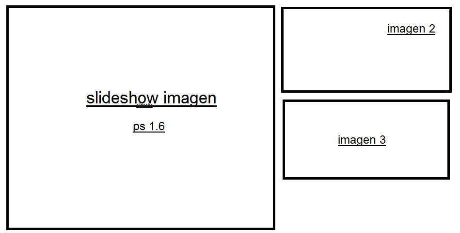
 Hola buenas, tengo una duda que a ver si alguien le pasa. Tengo instalado al prestashop 1.6 y el slideshow, no se ve bien en las tablets e ipad de 9 y 10 pulgadas. La imagen se descuadra.(ver imagen) En los probadores de resolucion estilo screenfly tampoco se ve bien para esas resoluciones. Si que se ve bien en el resto de resoluciones tanto en móviles como pantallas de ordenador. No he hecho ninguna modificación del prestashop, es la version original descargada. A alguien le ha pasado? como lo habéis solucionado? Gracias.
-
 For some reason my logo won't display on ipads and mobile (cell phones). I'm using the default bootstrap theme and Prestashop V 1.6.0.8 It just displays a Question Mark image. http://www.cmsbitz.com/presta/ I have tried uploading the image as logo.png, logo.jpg, and also changing the name from logo. Nothing seems to work. Has anyone else had the same problem? Do you know how to fix it? Many thanks in advance.
 -
 Bonjour à tous, J'ai un problème sur mon site. Le module featured product ou produits phares fonctionne bien sous Windows, Android mais lorsque je vais sur le site avec Ipad ou Iphone les produits ne sont pas cliquables et donc il n'est pas possible d'aller sur la page du produit en question. Avez-vous déjà rencontré ce problème? Pour info, voici l'url du site : http://www.unjourjeserai.com/ Merci pour votre aide.
 -
Hi I was wondering if anyone with an iPad could test something for me. I have a client that says, that when they touch a product on http://smoke-it.dk, they have to keep the finger on the product for 4 seconds before it reacts? Can anyone confirm that issue?
-
Telefoni cellulari (mobili) e tablet sono un mercato in crescita, e sempre più persone usano per navigare (3 miliardi, o giù di lì e questo sta crescendo ogni giorno). Ma la gente ha bisogno di siti adatti per i loro dispositivi. v1.2 - you can test on desktop pc v1.3-popup to choose mobile or dektop version v1.4-better code and support of bada v1.5-can disable hook in product page v1.6- better categories and option for backup configuration v1.7 - Can disable extra actions on product page, and product footer.Fixed some issues on css v1.9-Added option to adjust images automatically in product page (ps 1.4.8.2) and fix in slider v2.0 - Added option to limit the categories name, and reprogramed the mobile device detection (more mobiles added) v2.1- Supportsmostmobile devices. Fixedbugin1.4.8Productfilteringand selection oflanguages v2.2 - Aggiunta l'opzione di selezione mobile / desktop piè di pagina e una migliore facilità. Per aggiornare eseguire il backup della configurazione da pmobile, caricare il modello e il modulo via ftp, disinstallare e reinstallare e infine caricare il backup dal pmobile v2.3 - modello di velocità di aggiornamento. Aggiungere la configurazione del collegamento dell'immagine sulla home page. Accessori di design prodotti migliori. Aggiornamenti jquery e gli stili CSS. Per eseguire l'aggiornamento a questa versione, sostituire il modello e il modulo, è necessario forzare la compilazione e disabilitare la cache, e configurare il modulo con le nuove opzioni. v2.4 - Risolto un problema con ID nel registro utenti (non deve essere richiesto). Solo sostituire ordine opc-new-account.tpl e authentication.tpl. E la correzione di ordine portante negozi e per migliorare la compatibilità v2.5 - Abbiamo aggiunto il supporto per PS 1.5 (nuovo modello nella cartella themes/prestashopm5), anche dalla precedente configurazione del modulo Vistra, e può configurare il sottodominio in PS 1.4. La versione 1.5 è in beta, che può bug report pro v2.7 - Aggiornato per PS 1.5.3.1, il miglioramento della ricerca e selezione di versione mobile / desktop, miglioramenti nelle categorie v2.8 - maggiore compatibilità con le versioni precedenti di PS 1.4. Categoria del modulo di Miglioramento Aggiornamento alla versione più recente di jquerym Aggiungiamo un'icona di collegamento su PS 1,5 v2.9 - Pagina prodotto aggiornate nella versione PS 1.5, e alcune correzioni di bug con immagini pMobile rende questo compito posizionare correttamente visualizzando in compresse (iphone, android, ecc.) e telefoni (iphone, samsung, blackberry), riducendo il tempo di carico e mostrando un ambiente pulito e configurabile. L'installazione è molto semplice (è installato come qualsiasi modello) e verrà visualizzata solo in compresse e dispositivi mobili. Il design di controllo è molto ampio, perché il modulo permette i moduli abilitare per la versione mobile (senza intaccare la versione desktop). È possibile selezionare dalla configurazione del modulo, in modo che verranno utilizzati dispositivi. Alcuni punti salienti sono: creazione di una home page specificata per mobile (numero di prodotti in vetrina, immagine di avvio, facebook, twitter). Immagini di cursore per evidenziare i prodotti. Pagine CMS nel piè di pagina o link a pagine statiche (nuovi prodotti, contatto, negozi). Impostazione dello stile del negozio tramite css (configurabile con i modelli che porta fino a 3 combinazioni per ogni elemento dell'intestazione, piè di pagina, blocchi). Attivare o disattivare moduli per la versione mobile. Chiamare a noi pulsante. pMobile supporta i seguenti sistemi: Apple iOS 3.2-5.0 - testato su iPad originale (4.3 / 5,0), iPad 2 (4.3), iPhone originale (3.1), 3 (3.2), iPhone 3G (4.3) e 4 (4.3 / 5.0) Android 2.1-2.3 – testato sull'HTC incredibile (2.2), originale Droid (2.2), colore Nook (2.2), Aria di HTC (2.1), Google Nexus S (2.3). Funzionale su 1.5 e 1.6, ma le prestazioni può essere lenta, testato su Google G1 (1.5) Android a nido d'ape- testato nella scheda Samsung Galaxy 10.1 e Motorola XOOM Windows Phone 7-7.5 – testato sul Surround HTC (7.0) HTC Trophy (7.5) e LG-E900 (7.5) Blackberry 6.0 -testato sulla torcia 9800 e stile 9670 Blackberry 7 – testato su BlackBerry ® torcia 9810 Blackberry Playbook – testato su PlayBook versione 1.0.1 / 1.0.5 Palm WebOS (1,4-2.0) – testato sul Palm Pixi (1.4), Pre (1.4), Pre 2 (2.0) Palm WebOS 3.0-Testato su HP TouchPad Focolare Mobile (Beta) -testato su Android 2.2 Opera Mobile 11.0: testato su Android 2.2 Meego 1.2 – testato su Nokia 950 e N9 3 Kindle e fuoco: testato sul browser WebKit incorporato per ogni Bicromato di potassio Desktop 11-15-testato su OS X 10.6.7 e Windows 7 Firefox Desktop 4-8 – testato su OS X 10.6.7 e Windows 7 Internet Explorer 7-9 -testato su Windows XP, Vista e 7 (problemi minori CSS) Opera Desktop 10-11 - testato su OS X 10.6.7 e Windows 7 Un esempio di disegni selezionabile dalla configurazione del modulo (con arrotondato o quadrato) Nota: Selettore colore non è supportato in questo momento (è possibile selezionare nel menu a discesa) Demo di come funziona su iphone (è solo una simulazione). Visita www.prestashoptemplates.com.ar/test46/index.php per una dimostrazione reale sul vostro dispositivo mobile owww.prestashoptemplates.com.ar/test46/pmobile.html per una simulazione su iphone e una tavoletta. Supportate i moduli (è possibile aggiungere ulteriori modifica lo stile e la configurazione nel modulo pmobile): Blockadvertising-blockbestsellersblockcart - blockcategories - blockcms - blockcurrencies - blocklanguages - blockmanufacturer - blockmyaccount - blocknewproducts - blocknewsletter - blockpaymentlogo - blockpermanentlinks - blockrss - blocksearch - blockspecialsblockstore - blocktags - blockuserinfo - blockviewed - blockwishlist - selling - editoriale - followup - nomemodulo - fedeltà - pmobile - productscategory - referralprogram - sendtoafriend http://catalogo-onli...ivi-movile.html
-
hi, the new slideshow has support for touch devices like ipad, iphone or android. Is there any possibility to get this feature for the fancyboxes? bye Martin
-
Hi I have been developing a theme for my own webshop by modifiying the.CSS and some .TPL files until a desired layout is achieved. I've continuously been testing the results in 4 broswsers: Firefox, Chrome, IE and Safari All 4 is looking good. But when I go to my Ipad the whole site moves to left and additional space appears on the right side. It's like that the whole page moves to the left side. Most of my "positions" in the CSS is set to "absolute" and I think for responsive design it should be set to "fixed" but I'm not sure and pretty confused at the moment! Can anyone help so that everything stays at their positions no matter screen size, or help me to make the whole thing responsive so it fits into all screen sizes. url: www.weekendcph.com
-
 Salut, Le but de Appixia est de laisser les boutiques en ligne construire leurs propres applications mobiles professionnelles, qui sont aussi bon que ce géants de la distribution comme Amazon / eBay ont. Notre intuitive app-Builder vous permet de faire exactement cela sans réellement être un programmeur portable vous-même. Et maintenant, avec notre licence communautaire, vous pouvez même le faire gratuitement. Voici une petite vidéo de Appixia en action: Comment ça marche? Nous offrons une licence communautaire riche en fonctionnalités. Pas de frais cachés, vous pouvez construire et utiliser votre application gratuitement. L'application se connecte à votre serveur de Prestashop utilisant un module open-source https://github.com/a...ugin-prestashop Les produits sont prises à partir de votre serveur en temps réel. Toutes les transactions sont traitées à votre panier, comme d'habitude. Connaissance en programmation n'est nécessaire. Utilisez vos compétences techniques existantes pour créer des applications. Puissant et suffisamment souple pour créer presque n'importe quelle application que vous pouvez imaginer. Jetez un oeil à quelques vraies applications de nos utilisateurs ont fait: http://appixia.com/examples.php Comment est Appixia différent des autres solutions mobiles? Beaucoup d'autres solutions sont limités à des modèles prédéfinis - facile à obtenir une application, mais impossible de faire des changements réels. Appixia est conçu pour la personnalisation. Appixia crée un ensemble d'applications véritablement indigènes par plate-forme, pas une seule application "magique" qui fonctionne partout. Contrairement aux Sencha / Appcelerator / Objective-C / Java, vous n'avez pas besoin d'apprendre un nouveau langage de programmation. Pour adhérer, veuillez visiter http://appixia.com/plans.
- 72 replies
-
- 3
-

-
- m-commerce
- mobile
- (and 7 more)
-
Ciao, Lo scopo è quello di far Appixia sito online a costruire le proprie applicazioni mobili professionali, che sono buono come quello che giganti del retail come Amazon / Ebay hanno. La nostra intuitiva app-builder ti permette di fare proprio questo senza essere un programmatore cellulare te stesso. E ora con la nostra licenza comunitaria, si può anche fare questo gratuitamente. Ecco un breve video del Appixia in azione: Come funziona? Offriamo una licenza comunità pieno di funzionalità. Nessuna commissione nascosta, è possibile creare e utilizzare la tua applicazione gratuitamente. L'applicazione si connette al server Prestashop utilizzando un modulo open-source https://github.com/a...ugin-prestashop I prodotti sono presi dal server in tempo reale. Tutte le transazioni sono elaborate su il carrello, come al solito. Conoscenze di programmazione non è necessario. Usa le tue capacità tecniche esistenti per costruire applicazioni. Potente e flessibile abbastanza per creare praticamente qualsiasi applicazione che si possa immaginare. Date un'occhiata a alcune applicazioni reali i nostri utenti realizzati: http://appixia.com/examples.php Come è Appixia diverso dalle altre soluzioni di telefonia mobile? Molte altre soluzioni sono limitate a modelli predefiniti - facile per ottenere un app, ma impossibile fare cambiamenti reali. Appixia è progettato per la personalizzazione. Appixia crea un set di applicazioni realmente native per la piattaforma, non una sola app "magico" che corre dappertutto. A differenza con Sencha / Appcelerator / Objective-C / Java non hai bisogno di imparare un nuovo linguaggio di programmazione. Per partecipare si prega di visitare http://appixia.com/plans.
- 7 replies
-
- 1
-
-
- mobile commerce
- m-commerce
- (and 8 more)
-
 Bonjour, Je suis confronté à un problème bien étrange. Sur mon site, lorsqu'un client est sur ipad dans le tunnel de commande , quand on clique sur suivant après la sélection du transporteur j'ai une page introuvable mais seulement sur ipad. Sur Iphone,Internet explorer,opera,firefox pas de soucis. Je n'ai pas de thème mobiles activé et dans .htaccess je n'ai rien mis suivant les agents, , j'ai vidé le cache, forcer la recompilation mais rien ne fonctionne. J'ai un clone du site pour mes tests et mes dev, et je n'ai pas le soucis. Avez vous une idée, ou un bug connu (j'ai cherché dans le forum , je n'ai pas trouvé ce pb) ? Merci Micke
 -
Hello! I am about to launch my shop but I noticed a critical error just by coincidence! Everything (my shop) works fine on my PC, but when I decided to check it with iPAD I realized that I cannot navigate! For example, when I try to swipe in order to go at the bottom of my shop page it doesn't respond. Links are working though. Any ideas or hints what could be wrong? Shop address - www.nsoshoptest.tk Thank you in advance!
-
 Hola chicos! Verán tengo mi página ya alojada y el bloque de "contacto" se ve bien en mi pc pero cuando lo visualizo en IOS (ipad o iphone) se ve feisimo como recortado en donde se ven los telefonos de contacto. Gracias! MODIFICO EL TITULO DEL TEMA
 -
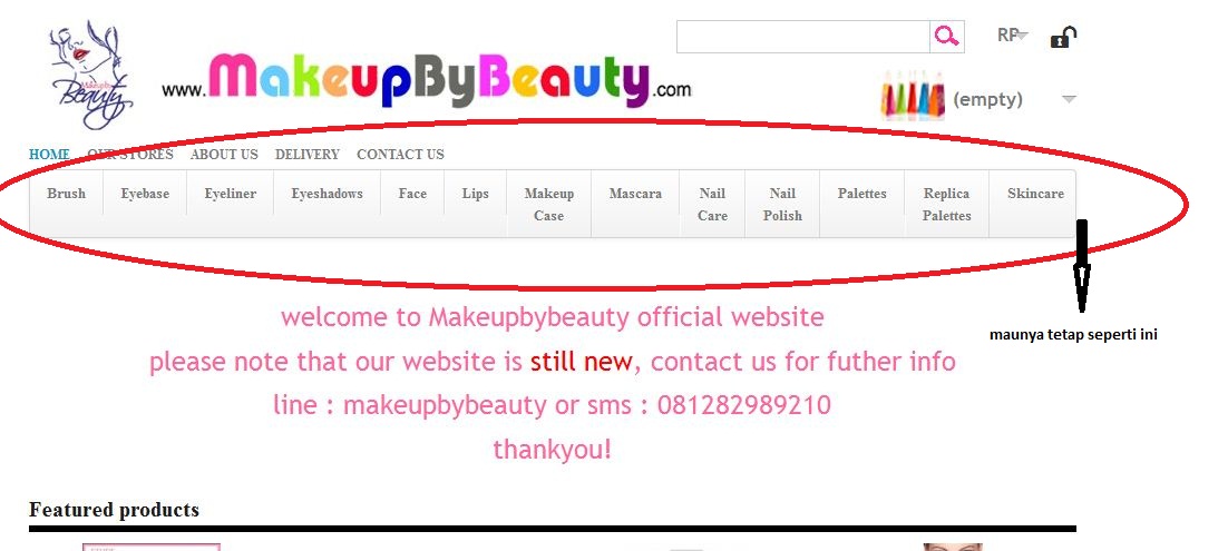
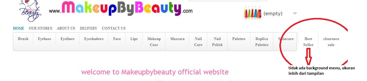
 Halo master, mohon bantuannya ya, ane punya masalah nih, mungkin simpel sih, tapi ane bingung gimana. ane pake versi 1.5.4.1, template fashonbird. ini web ane http://www.makeupbybeauty.com/ masalahnya ada 2: tampilan di tablets gak sesuai dengan layar device, tetep tampilan web (jadi terlalu lebar suhu), akibatnya categori menu agak ketutup. gimana cara ngaturnya suhu? kalo ane nambahin menu, jadinya gak dapat background menu lagi kayak gambar dibawah maunya tetep kayak gini suhu tapi jadinya kayak gini tolong ya suhu thanks salam presta
-
Ponsel (mobile) dan tablet pasar yang berkembang, dan semakin orang menggunakan untuk menavigasi (3 miliar atau lebih dan ini berkembang setiap hari). Tetapi orang-orang membutuhkan situs yang cocok untuk perangkat mereka. v1.2 - you can test on desktop pc v1.3-popup to choose mobile or dektop version v1.4-better code and support of bada v1.5-can disable hook in product page v1.6- better categories and option for backup configuration v1.7 - Can disable extra actions on product page, and product footer.Fixed some issues on css v1.8-new jquerym & better forms v1.9-Added option to adjust images automatically in product page (ps 1.4.8.2) and fix in slider v2.0 - Added option to limit the categories name, and reprogramed the mobile device detection (more mobiles added) v2.1- Supportsmostmobile devices. Fixedbugin1.4.8Productfilteringand selection oflanguages v2.3 - Update Template kecepatan. Tambahkan konfigurasi link dari gambar pada halaman rumah. Lebih baik desain aksesoris produk. Update jquery dan gaya css. Untuk meng-upgrade ke versi ini, ganti template dan modul, Anda harus memaksa kompilasi dan menonaktifkan cache, dan mengkonfigurasi modul dengan pilihan baru. to update, go to preferences, selecta your theme again and on pmobile put rewrite settings v2.2 - opsi pemilihan Tambahkan ponsel / desktop footer dan fasilitas lebih baik. Untuk meng-upgrade untuk backup konfigurasi dari pmobile, upload template dan modul melalui ftp, uninstall dan menginstal ulang dan akhirnya memuat cadangan dari pmobile yang v2.4 - Fixed masalah dengan ID di registri pengguna (tidak perlu diperlukan). Hanya ganti order-opc-baru-account.tpl dan authentication.tpl. Dan koreksi agar-operator toko dan untuk meningkatkan kompatibilitas v2.5 - Kami menambahkan dukungan untuk PS 1.5 (template baru dalam folder themes/prestashopm5), juga dari konfigurasi modul Vistra sebelumnya, dan dapat mengkonfigurasi subdomain di PS 1.4. Versi 1.5 ini dalam versi beta, yang dapat laporan bug pro v2.7 - PS 1.5.3.1, mobil versiyonu / masaüstü arama ve seçimi, iyileştirme, kategoriler iyileştirmeler için Güncelleme v2.8 - kompatibilitas meningkat dengan versi PS 1.4. Peningkatan kategori modul Update ke versi terbaru dari jquerym Kami menambahkan ikon shortcut di PS 1.5 v2.9 - halaman produk Diperbarui di PS versi 1.5, dan beberapa perbaikan bug dengan gambar pMobile membuat tugas ini dengan benar tempat menunjukkan di tablet (iphone, android, dll) dan telepon (iphone, samsung, blackberry), mengurangi waktu buka dan menunjukkan yang bersih dan dikonfigurasi. Instalasi sangat sederhana (itu adalah diinstal seperti setiap template) dan hanya akan ditampilkan di ponsel dan tablet. Desain kontrol sangat luas, karena modul memungkinkan modul untuk memungkinkan untuk versi mobile (tanpa mempengaruhi versi desktop). Anda dapat memilih dari konfigurasi modul, sehingga perangkat yang akan digunakan. Beberapa highlights adalah: menyiapkan halaman rumah yang ditentukan untuk mobile (jumlah produk utama, citra boot, facebook, twitter). Gambar slider untuk menyorot produk. Halaman CMS di footer atau link ke halaman statis (produk baru, kontak, toko). Menetapkan gaya toko melalui css (dikonfigurasi dengan template yang membawa sampai dengan 3 kombinasi untuk setiap elemen-header, footer, blok). Mengaktifkan atau menonaktifkan modul untuk versi mobile. Panggilan ke us tombol. pMobile mendukung sistem berikut: Apple iOS 3.2 5.0 - Tested on iPad asli (4.3 / 5.0), iPad 2 (4.3), iPhone asli (3.1), 3 (3.2), iPhone 3GS (4.3), dan 4 (4.3 / 5.0) Android 2.1-2,3 -diuji pada HTC biasa (2.2), asli Droid (2.2), sudut warna (2.2), HTC Aria (2.1), Google Nexus S (2,3). Fungsional pada 1,5 & 1.6 tapi kinerja mungkin lamban, diuji di Google G1 (1.5) Android sarang lebah- diuji pada Tab Samsung Galaxy 10.1 dan Motorola XOOM Windows Phone 7-7,5-diuji pada HTC Surround (7,0) HTC Trophy (7,5), dan LG-E900 (7,5) Blackberry 6.0 -diuji pada obor 9800 dan gaya 9670 Blackberry 7 -diuji pada BlackBerry ® obor 9810 Diuji Blackberry pedoman -pedoman versi 1.0.1 / 1.0.5 Palm WebOS (1.4-2.0) -Tested on Palm Pixi (1.4), pra (1.4), pra 2 (2.0) Palm WebOS 3.0-Diuji di HP TouchPad Tungku Mobile (Beta) -diuji pada Android 2.2 Opera Mobile 11,0: diuji pada Android 2.2 FlashDevelop 1.2 -diuji pada Nokia 950 dan N9 Kindle 3 dan api: diuji pada built-in WebKit browser untuk masing-masing Chrome Desktop 11-15-diuji di OS X 10.6.7 dan Windows 7 Firefox Desktop 4-8 -diuji di OS X 10.6.7 dan Windows 7 Internet Explorer 7-9 -diuji pada Windows XP, Vista dan 7 (masalah CSS kecil) Desktop opera 10-11 - diuji di OS X 10.6.7 dan Windows 7 Contoh desain dipilih dari konfigurasi modul (dengan bulat atau persegi) Catatan: Color picker tidak didukung saat ini (Anda dapat memilih di dropdown menu) Demo tentang bagaimana bekerja pada iphone (hanya adalah simulasi). Kunjungi www.prestashoptemplates.com.ar/test46/index.php untuk demo nyata pada perangkat mobile atauwww.prestashoptemplates.com.ar/test46/pmobile.html untuk simulasi pada iphone dan tablet. Didukung modul (Anda dapat menambahkan lebih mengedit gaya dan konfigurasi di modul pmobile): Blockadvertising-blockbestsellersblockcart - blockcategories - blockcms - blockcurrencies - blocklanguages - blockmanufacturer - blockmyaccount - blocknewproducts - blocknewsletter - blockpaymentlogo - blockpermanentlinks - blockrss - blocksearch - blockspecialsblockstore - blocktags - blockuserinfo - blockviewed - blockwishlist - crossselling - editorial - ikutan - homefeatured - kesetiaan - pmobile - productscategory - referralprogram - sendtoafriend http://catalogo-onli...kat-movile.html
-
 Hi, I am working on my first site on presta and have a problem with the background. I have made the background image fixed and it works perfectly on computer monitors but when i use a ipad or a smartphone the background fixes on top center and is minimized... I have made the page wider using a guide on youtube - My settings are: body{ font:bold 11px/14px Arial, Verdana, sans-serif; color:#666; background-image: url(../img/back.jpg); background-repeat: no-repeat; background-position: top center; background-attachment: fixed; } I have attached images to show how it looks on a Ipad... Does anyone know what the problem might be?