.png.022b5452a8f28f552bc9430097a16da2.png)


Dawg
-
Posts
4 -
Joined
-
Last visited
Dawg's Achievements
")
Newbie (1/14)
0
Reputation
-
Hello guys, So today I realized that my website (as a lot of other websites) is changing the background depending on the individual preferences of users. This means that when someone have the DARK MODE active on mobile, when he'll enter to my website, the background of my store will be black but the elements in it will remain the same (including the color of the font which is... black). On other platforms I saw an option to force the theme to remain in Light Version even if the user's phone is in Dark Mode but on Prestashop I didn't found this. I have to mention that I'm talking about Prestashop 1.7 with theme Alysum version 5.4.0 and a module for mobile called Promokit Prestashop AMP module. L.E. Just realized that I didn't actually asked you something. So my question is How can I force stay in original light version of my theme even if the user is using Dark Mode on mobile? Thank you very much and I hope you understood my problem.
-
The right way to do it in Prestashop 1.7 is: /your site/themes/your theme/modules/productcomments/views/templates/hook/post-comment-modal.tpl There you'll find the next code <div class="col-md-2 col-sm-2"> {if $criterions|@count > 0} <ul id="criterions_list" class="media-list"> {foreach from=$criterions item='criterion'} <li> <div class="criterion-rating flex-container align-items-center"> <label>{$criterion.name|escape:'html':'UTF-8'}:</label> <div class="grade-stars pk-loader" data-grade="3" data-input="criterion[{$criterion.id_product_comment_criterion}]"> </div> As you can see, the "data-grade" is set to 3 so all you'll have to do is replace data-grade="3" with data-grade="5". If that's easier, just replace with this <div class="col-md-2 col-sm-2"> {if $criterions|@count > 0} <ul id="criterions_list" class="media-list"> {foreach from=$criterions item='criterion'} <li> <div class="criterion-rating flex-container align-items-center"> <label>{$criterion.name|escape:'html':'UTF-8'}:</label> <div class="grade-stars pk-loader" data-grade="5" data-input="criterion[{$criterion.id_product_comment_criterion}]"> </div> Enjoy!
-
Hello everybody, I did my research and failed to find any topic about this. I found several topics about changing the default 3-star rating to 5-star rating but nothing about how to change the shape (the star image). So does anybody know how can I change the shape of the stars? I want to change them with heart shapes so the user can give 0 to 5 Hearts, not 0 to 5 Stars. I hope I posted in the right place, if not I am really sorry. Thank you very much, you guys are amazing!
-
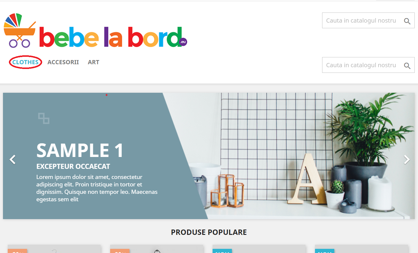
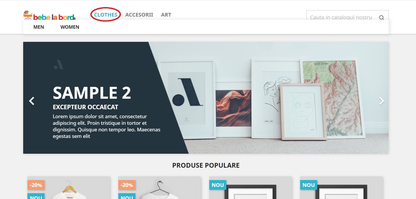
Hi guys, Sorry for bringing to life this old topic but I have a little problem and I don't know if you are also facing this. First of all, the tinygirl's script is working for this problem, thank you a lot for that BUT 1. The categories stop showing after I move the menu location (see in pictures attached: the one with the logo, menu and search box in line, (before.jpg) when I put my mouse on "Shoes", it reveals the subcategories and in the other picture where the menu and search box appears under the logo (after.png), when I put my mouse on "Shoes" nothing happens). 2. After using tinygirl's script for bringing the menu under the logo, I got 2 search boxes (as you can see in the screenshots). So my question is 'How can I move the menu under the logo but keep it full functional and also keeping only one search box (the one in line with the menu looks ok)?' (check the L.E. below to solve the search box problem) Thanks a lot guys! L.E. I removed the top search bar in my screenshot by removing the extra-code in tinygirl's solution. To keep only one search box in line with the menu text, under the logo, use the following code: {block name='header_top'} <div class="header-top"> <div class="container"> <div class="row"> <div class="col-md-8 hidden-sm-down" id="_desktop_logo"> {if $page.page_name == 'index'} <h1> <a href="{$urls.base_url}"> <img class="logo img-responsive" src="{$shop.logo}" alt="{$shop.name}"> </a> </h1> {else} <a href="{$urls.base_url}"> <img class="logo img-responsive" src="{$shop.logo}" alt="{$shop.name}"> </a> {/if} <div class="col-md-12 col-sm-12 position-static"> {hook h='displayTop'} <div class="clearfix"></div> </div> </div> <div id="mobile_top_menu_wrapper" class="row hidden-md-up" style="display:none;"> <div class="js-top-menu mobile" id="_mobile_top_menu"></div> <div class="js-top-menu-bottom"> <div id="_mobile_currency_selector"></div> <div id="_mobile_language_selector"></div> <div id="_mobile_contact_link"></div> </div> </div> </div> </div> {/block} Enjoy!